Storage Devices and RFID Applications in Healthcare
The Plan
This section covers how our group came up with this webpage, focusing on how we want to organize our information such that it appears clear and concise. We also took into consideration how we want the general visual aspect of our webpage to be, ensuring that it is catchy and not overly wordy.
Information Organization
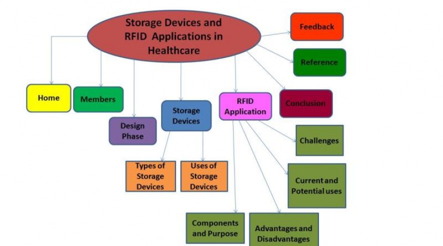
We made a unanimous decision to put the different categorizations into individual pages under their respective tabs instead of cramping all the information on one page with hyperlinks to scroll down to the various categorizations. We preferred this approach since we found this approach more organized and concise so that the reader can focus on the subtopic at any one point in time and not be distracted by other information above or below it in the case of clumping all the information on one page.
Presentation of Information
1) Titles in general need to be of a larger font to show emphasis on the topic/subtopic in discussion.
2) Have line spacing so that information do not appear in paragraphs of words. Have more space in between
points as well so that the person viewing will know that it is a new point that we are focusing on.
3) Use of pictures and graphics as illustrations to our points.
4) To ensure that the reader do not have to scroll up to the navigation bar before proceeding to another section, we included hyperlinks at the bottom of the section to the top of the page to minimize the need of scrolling.
Click here to return to the top of the page.
